Urban Sports Club app redesign
Design Goals:
- Better sports Schedule View
- Ideate Check-ins summary and monthly analytics
- New Venues within my interest exploration (landing page)
Resources & approachs:
- Urban Sports Club APP
- Google Search(Desk Research)
- Google Doc (Documentation)
- Figma (Wireframe & Screen Prototype)
time duration
- 20 hours ( Weekend Pet Project)
My story with Urban Sports Club (USC) app
As a fevered fan of dynamic sports activities after work time, and a heavy user of USC both app and web, I have been using urban sports club app with a daily basis for my workout programs for one year and a half.

Left: The daily average usage time Right: first used after pick up
To make sure I would stick to my workout plan and achieve the monthly goals, i.e. next PR for bench press, 1 new technical move of MMA grappling, able to do Handstand on my own, I always craft my weekly workout plan two weeks ahead.
This is also because on USC app, you are able to book activities at the earliest 2 weeks ahead, and the popular ones are fully booked once it got released.
Furthermore, I use google calendar to track my USC visits, for instance,
- Which venues do I visit this month ?
- How many limits do I have for X venues ?
- What type of workout I did on last Wednesday ?
- What’s the training plan for the WOD class yesterday ?
- What’s my personal record for rowing machine so far ?
USC is a platform serving both personal users and sports clubs. These records and information could be very valuable to both a user to keep and track the workout plan and share with the others, and to the venue to find out the feedback of the activities, and environments, so as a reference for improvement to attract more traffics.
1. New info-structure on bottom menu bar, A dedicated schedule Screen in the calendar view
To a better information structure, as well as to improve the overview of one’s Schedule and Check-ins. In my design proposal, There is a dedicated Schedule screen, the icon in the place where Scan icon supposed to be.
This change is because that currently on the USC app, Schedule list, next to the Check-ins and Favourites.
From information structure perspective, these 3 are not really in the same category, thus it makes less sense to position them on the same level of page with the horizontal tab view.
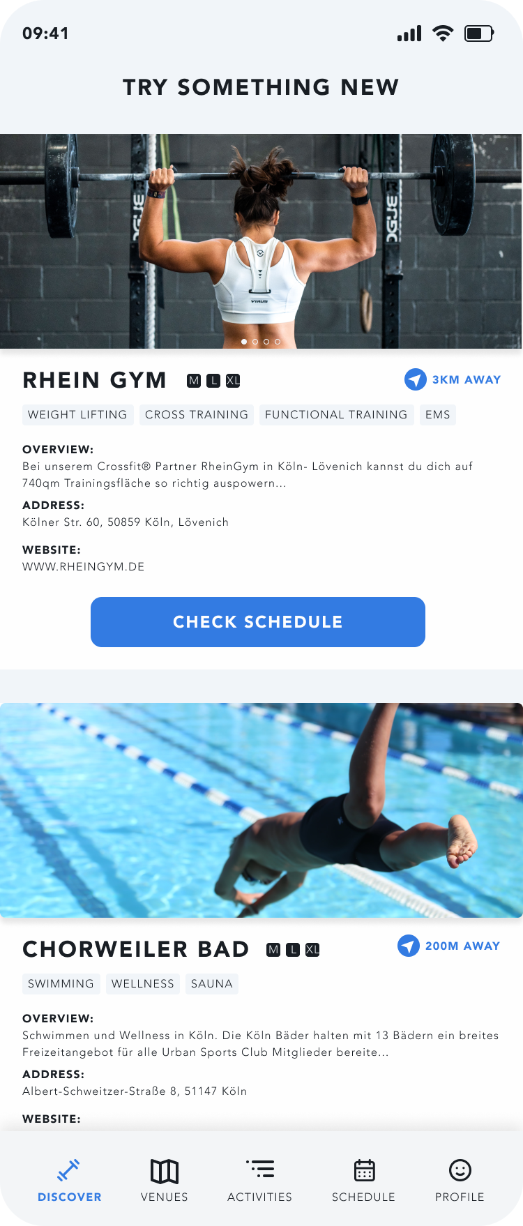
2.1 new Landing Screen, New structure and aligned layout and style
Currently, on USC landing page, the unaligned layout for Venues and Activities makes the screens very busy, especially on a small mobile view. My first step is to make consistent layout with grids to make the screen looks clean and structured, both logically and visually wise.
2.2 Personal Recommendation
Additionally, my personal experience is that the 2 most approaches I try the new Venues and Activities is
1. they serve the similar workout I am going on a regular basis
2. or it’s a referral from a friend Thus, for 1000 USC users, there should be 1000 different content on the landing screens.
Following my user experience and design thinking, the top 3 categories are
1. Most visited activities, quick access to regular bookings, for a better usabilities
2. Try something new ( recommendations for the venues based on the type of activities one going regularly)
3. What’re your friends up to ( a potential better conversion as a referral from friend networks. Furthermore, this is the first step is USC would love to build a social network community)
3. How to scan to check-in? just Swap the Screen to the right
To compensate for removing Check-ins from the menu bar, I introduce a new interaction way, swapping any first-level page to the right, to activate the scan QR code. A dedicated CHECK-INS icon on the menu bar, I believe, kills a lot of potential for better access to other features and information. This interaction change not just only resolves this issue, but also doesn’t add more steps for the user to activate the SCAN to check in.
4. Activity and Venues Screen
- better access to book and add activity to the schedule
- introduce new feature waiting list for a better overview of activities on the venus page (map view)
One of my paint points on USC app is that I can’t be aware if one activity is fully booked until I land on the activity detail page. Thus, I come to the idea to bring the booking/schedule button, and available spots directly on the activities list page.
What’s more, when the activities are fully booked. You could set up a reminder/waiting list so that USC could push you a notification once there’s a free spot.
5. Schedule Screen: calendar view integrated with check-ins
This idea of the feature came from the that I always use google calendar to plan and set reminder to schedule my favorite activities.
Comparing a list view with Schedule and Check-ins are separated, a calendar view carries a much better overview of both coming scheduled activities, as well as the past check-ins.
This is very helpful for the user with a regular workout plan, who is highly possible a heavy user of the USC app.
6. Profile Screen: better information display, tracking my check-ins records
One step further than just counting the Check-ins times, here I use the different graphs to show for certain venues, how many times you are still able to visit for this month, and what type and time durations for the workout you are going.
The summary with graphs has a big value to help the user to record and analysis their activities better. At the same time, for USC app, to run a better algorithm for the recommendations on the landing screen.
wrap up
The redesign of USC app is fully based on my personal user experience and the feedback from my friend circles.
Certainly, there’re a lot of spaces to optimize and explore my design proposals. Yet, the purpose of this pet project is more than to show my design thinking, knowledge, and skill sets. It’s also to show my passion, as for a user and designer to sports and fitness industry, which is the secret source of infinite dedication to delivering good designs.
And yes, I work 20 hours at one weekend to craft out this design proposal.
And I totally enjoyed it!